HTML/CSS
to merge from bits of design. aaand break out. and generally sort.
Standards
- W3C Standards for the Open Web Platform
- http://www.w3.org/community/
- http://lists.w3.org/Archives/Public/
- http://www.w3.org/2005/Incubator/XGR/
- http://www.webplatform.org/
- http://en.wikipedia.org/wiki/Open_Web_Platform
- http://en.wikipedia.org/wiki/Web_service
See also Data
HTML
- HTML Living Standard - browser company base standard
- HTML5: A technical specification for Web developers
- HTML: The Markup Language
- HTML5: Edition for Web Authors - omits UA aspects
- HTML5: Editor's Draft - bleeding edge w3c
- HTML5.1
- On the WHATWG HTML Living Standard process - Feb 25, 2012
- Update on the relationship between the WHATWG HTML living standard and the W3C HTML5 specification - 19th Jul, 2012
- HTML 5 gets forked up - 23rd July, 2012 [1]
CSS
- W3C: CSS (2010 snapshot)
Docs, guides, etc.
Basics
- A Beginner’s Guide to HTML & CSS is a simple and comprehensive guide dedicated to helping beginners learn HTML and CSS. Outlining the fundamentals, this guide works through all common elements of front-end design and development.
- Dive Into HTML5 by Mark Pilgrim
- HTML5 tag cheatsheets
- Webmaker — a Mozilla project dedicated to helping you create something amazing on the web. Our tools, events and teaching guides allow webmakers to not only create the content that makes the web great, but — perhaps more importantly — understand how the web works.
- Mozilla Developer Network
- Web Platform - Apple, Adobe, Facebook, Google, HP, Microsoft, Mozilla, Nokia, and Opera
- Introduction to The Web Standards Curriculum - Opera
- Web Education Community Group Wiki - w3c
- CSS Structure and Rules - htmlhelp.com
Resources
- HTML5 Tutorials for Keeping Your Design Skills Tight - Jul 23, 2012
- HTML5 Rocks: Resources
- The Evolution of the Web
- W3Techs - World Wide Web Technology Surveys
Articles
- About HTML semantics and front-end architecture
- HTML5 id/class name cheatsheet - Or, “The mapping of HTML5 structural elements to id and class names for use with divs”
- Principles of writing consistent, idiomatic CSS
- Scalable and Modular Architecture for CSS (SMACSS)- A flexible guide to developing sites small and large.
- http://blog.responsivenews.co.uk/post/18948466399/cutting-the-mustard
- http://engineering.appfolio.com/2012/11/16/css-architecture/
Project basics
Favicon
Articles
Tools
- Favicon Generator
- Collabyrinth
- png2ico - PNG to icon converter - doesn't preserve alpha
- X-Icon Editor - nice
- AllTheFavIcons - does it all
- http://faviconist.com - no quick small fonts
- http://antifavicon.com/ - small fonts, double line only
- http://www.favicon.cc/
JavaScript
Resets, normalize, etc.
Different browsers have different defaults. You can either reset them to zero, or normalise with cross-browser sensible defaults.
- Eric Meyer's CSS Tools: Reset CSS - a classic reset
- normalize.css - A modern, HTML5-ready alternative to CSS resets
- HTML5 Reset - A simple set of templates for any project
- stackoverflow: What is the difference between Normalize.css and Reset CSS?
Polyfills, shim/shivs
For fixing the lack of HTML5/CSS3 support in older browsers.
- Modernizr is a small JavaScript library that detects the availability of native implementations for next-generation web technologies, i.e. features that stem from the HTML5 and CSS3 specifications. Many of these features are already implemented in at least one major browser (most of them in two or more), and what Modernizr does is, very simply, tell you whether the current browser has this feature natively implemented or not.]
- Custom download - Use the Development version to develop with and learn from. Then, when you’re ready for production, use the build tool to pick only the tests you need.
- Documentation
- https://github.com/Modernizr/Modernizr/wiki/HTML5-Cross-Browser-Polyfills
- http://yepnopejs.com/ - used in modernizer
- http://www.useragentman.com/blog/csssandpaper-a-css3-javascript-library/
- http://ecsstender.org/
- http://selectivizr.com/
Filters
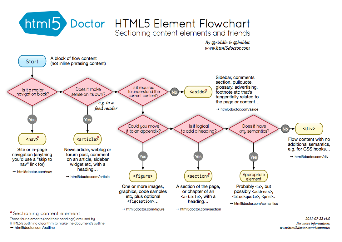
Structure
- WhatWG: Headings and sections
- MDN: Sections and Outlines of an HTML5 Document
- Dive into HTML5: semantics
Meta
Elements
- sections;
- body, main, section, nav, article, aside, h1, h2, h3, h4, h5, h6, hgroup, header, footer, address
- grouping;
- p, hr, pre, blockquote, ol, ul, li, dl, dt, dd, figure, figcaption, div
- text level;
- a, em, strong, small, s, cite, q, dfn, abbr, data, time, code, var, samp, kbd, sub/sup, i, b, u, mark, ruby, rt, rp, bdi, bdo, span, br, wbr
Articles
- HTML5 Doctor: Document Outlines - July 12th, 2011
hrm;
- http://demosthenes.info/blog/522/HTML5-Best-Practices-For-header-section-and-primary-navigation
- http://www.sitepoint.com/forums/showthread.php?847136-HTML5-Section-vs-Article-elements
- http://www.netmagazine.com/features/truth-about-structuring-html5-page - ouch! hrrmm.
div
span
Comments
<!-- this is
 a multiline
 comment -->
Doctype
Style
Anchor
Images
See Graphics
Lists
- MDN: Lists
From Wikipedia;
list-style-image: url(data:image/png;base64,iVBORw0KGgoAAAANSUhEUgAAAAUAAAANAQMAAABb8jbLAAAABlBMVEX///8AUow5QSOjAAAAAXRSTlMAQObYZgAAABNJREFUCB1jYEABBQw/wLCAgQEAGpIDyT0IVcsAAAAASUVORK5CYII=);
Horizontal list;
#navlist li {
  display: inline;
  list-style-type: none;
  padding-right: 20px;
}
Quote
Forms and input
- HN: Don't Be Lazy, Use HTML Labels Correctly
- http://www.tripwiremagazine.com/2010/05/submit-button-enhancements.html
Commands
Video
Tab order
Pseudo-elements
- 5.10 Pseudo-elements and pseudo-classes
- css-tricks: A Whole Bunch of Amazing Stuff Pseudo Elements Can Do - Jun 13 2011
q::before { content: "»" }
q::after { content: '«' }
Was just one colon, but CSS3 added another to distinguish from pseudo-classes.
content: "";
  needed to display
- What's the Difference Between ":before" and "::before"? - Jan 13 2011
- The Lowdown on :Before and :After in CSS - 13 Jan 2012
element {
  position: relative;
  background: black;
}

element:before, element:after {
  content: "";
  position: absolute;
  background: black;  /* Match the background */
  top: 0;
  bottom: 0;
  width: 9999px;   /* some huge width */
}

element:before {
  right: 100%;
}

element:after {
  left: 100%;
}
html, body {
   overflow-x: hidden;
}
To the left;
element:after {
  display: none;
}
To the right;
element:before {
  width: 20px;
}
Step it up, step it up, it's alright.
Tables
Not bad for tabular data, styling has advantages and disadvantages..
<table border="1">
   <tr>
     <th colspan="2">Table header</th>
   </tr>
   <tr>
     <td>Table cell 1</td><td>Table cell 2</td>
   </tr>
 </table>
- https://developer.mozilla.org/en-US/docs/CSS/border-collapse
- https://developer.mozilla.org/en-US/docs/CSS/border-spacing
Units
- CSS Values and Units Module Level 3 - W3C Working Draft 8 March 2012
- CSS Values and Units Module Level 3 - Editor's Draft 19 July 2012
- 1em - element font size (affected by element nesting depth)
- 1rem - root element font size
- 1em = 16px (by default anyway)
- 1px (css pixel) = 1/96in
- 1vp = 1% viewport width
- 1in (inch) = 2.539954cm
- 1pt (point) = 1/72in
- 1pc (pica) = 12pt
- https://developer.mozilla.org/en-US/docs/CSS/length
- https://developer.mozilla.org/en-US/docs/CSS/angle
rem
- http://coderwall.com/p/1v6gfq
- ROOT EM! Using CSS3 "rem" Units for "Elastic Pixels"
- http://tetsubo.org/2012/01/developing-with-rem-based-layouts/
- http://css-tricks.com/snippets/css/less-mixin-for-rem-font-sizing/
- https://github.com/ry5n/rem - sass mixin
v*
100vw == window.width
examples
color
- CSS Color Module Level 3 - W3C Recommendation 07 June 2011
The color CSS property sets the foreground color of an element's text content, and its decorations. It doesn't affect any other characteristic of the element; it should really be called text-color and would have been named so, save for historical reasons and its appearance in CSS Level 1. Note that, the color value must be a uniform color, eventually not completely opaque, and can't be a <gradient> which is a <image> in CSS.
color: red;                     // A CSS Level 1 color
color: orange;                  // The only color added in CSS Level 2 (Revision 1)
color: antiquewhite;            // A CSS Level 3 color, sometimes called a SVG or X11 color.
color: #0f0;                    // The color 'lime' defined using the 3-character dash notation.
color: #00ff00                  // The color 'lime' defined using the 6-character dash notation.
color: rgba( 34, 12, 64, 0.3);  // A color defined using of the available functional notations.
color: currentColor;            // The special keyword representing the color's value of its direct ancestor
color: inherit
#bada55, etc.
- Stackoverflow: Why does HTML think “chucknorris” is a color?
Selectors
- Selectors API Level 1 - W3C Recommendation 21 February 2013
- Selectors API Level 2 - W3C Working Draft 28 June 2012
- Selectors Level 3 - W3C Recommendation 29 September 2011
- Selectors Level 4 - W3C Working Draft 2 May 2013. Implemented in Sass.
- http://www.w3.org/community/webed/wiki/CSS/Selectors
- http://learn.shayhowe.com/advanced-html-css/complex-selectors
- http://twostepmedia.co.uk/cssselectors/
- http://csswizardry.com/2011/09/writing-efficient-css-selectors/
- http://net.tutsplus.com/tutorials/html-css-techniques/the-30-css-selectors-you-must-memorize/
- http://csswizardry.com/2012/07/shoot-to-kill-css-selector-intent/
h1 > h2
  child combinator
  just matching first order descendant elements
Specificity
HN: 256 CSS Classes Can Override an #id
!important
Attribute selectors
Pseudo-classes
- MDN Pseudo-classes
From Pseudo Class Selectors;
:root
  Selects the element that is at the root of the document. Almost certainly will select the <html> element, unless you are specifically working in some weird environment that somehow also allows CSS. Perhaps XML.

:first-child
  Selects the first element of its type within a parent.

:last-child
  Selects the last element of its type within a parent.
:nth-child(N)
  Selects elements based on a simple provided algebraic expression (e.g. "2n" or "4n-1"). Has the ability to do things like select even/odd elements, "every third", "the first five", and things like that. Covered in more detail here with a tester tool.

:nth-of-type(N)
  Works like :nth-child, but used in places where the elements at the same level are of different types. Like if inside a div you had a number of paragraphs and a number of images. You wanted to select all the odd images. :nth-child won't work there, you'd use div img:nth-of-type(odd). Particularly useful when working with definition lists and their alternating -dt- and -dd- elements.

:first-of-type
  Selects the first element of this type within any parent. So if you have two divs, each had within it a paragraph, image, paragraph, image. Then div img:first-of-type would select the first image inside the first div and the first image inside the second div.

:last-of-type
  Same as above, only would select the last image inside the first div and the last image inside the second div.

:nth-last-of-type(N)
  Works like :nth-of-type, but it counts up from the bottom instead of the top.

:nth-last-child(N)
  Works like :nth-child, but it counts up from the bottom instead of the top.

:only-of-type
  Selects only if the element is the only one of its kind within the current parent.
Parent
CSS Selectors 4 Spec
Layout
width
display
display: block - default 100% width, flows vertically
display: inline - consumes width of content, flows horizontally
display: inline-block
display: table-cell - vertical align method [3]
  http://www.quirksmode.org/css/display.html
float
float - floats element next to containing box or other floated element
clear
position
position: absolute - out of flow
position: fixed
- https://github.com/andreasbovens/understanding-viewport
- http://www.brainjar.com/css/positioning/default.asp
sticky
- http://updates.html5rocks.com/2012/08/Stick-your-landings-position-sticky-lands-in-WebKit
- https://air.mozilla.org/intern-presentation-ford/ [4]
vertical align
- http://phrogz.net/css/vertical-align/index.html
- http://blog.themeforest.net/tutorials/vertical-centering-with-css/ [5]
- http://css-tricks.com/what-is-vertical-align/
- http://www.barelyfitz.com/screencast/html-training/css/positioning/
margin: auto;
position: absolute;
top: 0; left: 0; bottom: 0; right: 0;
overflow
prevent scrollbars
- https://developer.mozilla.org/en-US/docs/Web/CSS/overflow
- https://developer.mozilla.org/en-US/docs/Web/CSS/overflow-x
- https://developer.mozilla.org/en-US/docs/Web/CSS/overflow-y
z-index
z-index works only on absolute or relative positioned elements.
- https://developer.mozilla.org/en-US/docs/CSS/Understanding_z-index
- http://en.wikipedia.org/wiki/Z-index
- http://philipwalton.com/articles/what-no-one-told-you-about-z-index/
via js;
object.style.zIndex="1"
flexbox
box-sizing
- https://developer.mozilla.org/en-US/docs/CSS/box-sizing
- http://docs.webplatform.org/wiki/css/selectors/box-sizing
- http://paulirish.com/2012/box-sizing-border-box-ftw/ [7]
- http://stackoverflow.com/questions/2429819/why-is-the-w3c-box-model-considered-better
clip
Tips
- http://css-tricks.com/float-center/
- http://stackoverflow.com/questions/963636/why-cant-i-center-with-margin-0-auto
css is stoopid
Text
See also Typography
- http://stackoverflow.com/questions/471510/hide-text-using-css
- http://www.sitepoint.com/css3-starwars-scrolling-text/
text-align
text-align [ start | end | left | right | center ] || <string> ] | justify | match-parent | start end
text-rendering
text-rendering auto | optimizeSpeed | optimizeLegibility | geometricPrecision
"Basically, setting the value of “optimizeLegibility” for the “text-rendering” property lets you enable things like ligatures and more accurate kerning (the spacing between letters), which, as the name of the value implies, leads to improved legibility and an overall better appearance of the text as unnecessary spaces are eliminated where possible."
"There are actually significant, effectively fatal performance problems (such as 30-second loading delays, or longer) on mobile devices when using optimizeLegibility for long pages."
text-transform
text-transform: none | capitalize | uppercase | lowercase | full-width
text-shadow
- https://developer.mozilla.org/en-US/docs/CSS/text-shadow
- http://www.w3.org/Style/Examples/007/text-shadow.en.html
- http://www.wordpressthemeshock.com/css-text-shadow/
text-shadow: 0 1px 0 rgba(255,255,255,.1);
color: #fff;
text-shadow: 0 0 40px rgba(255,255,255,.25);
See also Style#Shadows
text-stroke
Webkit only.
- http://www.westciv.com/tools/textStroke/ - generator
- strokeText.js is an unobtrusive javascript library working in all the major browsers - Mozilla Firefox 1.5+, Opera 9+, Safari and IE6+. The library provides cross API text stroking capability for Canvas and VML. The (built in) sans-serif font is also adapted for SVG to ensure an identical representation.
text-overflow
text-overflow  [ clip | ellipsis | <string> ]
  determines how overflowed content that is not displayed is signaled to the users.
or with gradient; http://xion.org.pl/2011/12/26/text-ellipsis-with-gradient-fade-in-pure-css/
word-wrap
mask-image
- http://trentwalton.com/2011/05/19/mask-image-text/ - font texture
- http://trentwalton.com/bgclip/ - with transition
Properties
background
- background transparent || none || repeat || scroll || 0% 0%
background: #f00;
background: url('http://example.com/image.png');
background: url(bgimage.jpg) no-repeat;
- http://www.tizag.com/cssT/background.php
- http://www.vanseodesign.com/css/background-properties - w/ css3
.multi_bg_example {
  background: url(http://demos.hacks.mozilla.org/openweb/resources/images/logos/firefox-48.png),
    linear-gradient(to right, rgba(255, 255, 255, 0),  rgba(255, 255, 255, 1)),
      url(http://demos.hacks.mozilla.org/openweb/resources/images/patterns/flowers-pattern.jpg);
  background-repeat: no-repeat, no-repeat, repeat;
  background-position: bottom right, left, right;
}
- https://developer.mozilla.org/en-US/docs/CSS/Using_CSS_multiple_backgrounds
- http://nicolasgallagher.com/multiple-backgrounds-and-borders-with-css2/ - older
background-color
background-color: white;
background-image
background-image: url('file.png')
- http://jsfiddle.net/estelle/SJjJb/ - SVG at a data URI for background images...
background-repeat
background-repeat: no-repeat;
  stops the image repeating (tiling)
background-position
background-position: 0% 0%
background-attachment
background-attachment: scroll / fixed / local;
- http://people.opera.com/pepelsbey/experiments/bga/
- http://lea.verou.me/2012/04/background-attachment-local/
background-size
background-size: 100%;
  make background exactly fit element

background-size: 50% 50%;
background-clip
background-clip: border-box / padding-box / content-box;
   specifies whether an element's background, either the color or image, extends underneath its border.
background-clip: text;
  works well with text-fill-color: transparent;
border
border: <border-width> || <border-style> || <color>
element { border: dashed }          /* dashed border of medium thickness, the same color as the text */
element { border: dotted 1.5em }    /* dotted, 1.5em thick border, the same color as the text */
element { border: solid red }       /* solid, red border of medium thickness */
element { border: solid blue 10px } /* solid, blue border of 10px thickness */
border-radius
broder-radius [ <length> | <percentage> ]{1,4} [ / [ <length> | <percentage> ]{1,4} ]?
gradients
- http://24ways.org/2010/everything-you-wanted-to-know-about-gradients/
- http://lea.verou.me/css3-gradients/
- http://nicolahibbert.com/css3-alpha-transparent-gradients/
linear
linear-gradient([ [ [ <angle> | to [top | bottom] || [left | right] ],]? <color-stop>[, <color-stop>]+);
background: linear-gradient(to right, red, orange, yellow, green, blue, indigo, violet);
background-image: linear-gradient(to bottom right, red, rgba(255,0,0,0));
- 00ffffff colour breaks Sass (argb hex)
radial
Tools
mask
No IE or FF [8]. FF SVG hack.
box-shadow
box-shadow: inset? <offset-x> <offset-y> <blur-radius>? <spread-radius>? <color>?, .etc

box-shadow: inset 0 0 10px rgba(0, 0, 0, 0.6);
box-shadow: inset 0 0.3em 10px -8px black;
- http://creativejuiz.fr/trytotry/css3-box-shadow-after-before/
- http://playground.genelocklin.com/depth/
- http://theamazingweb.net/2012/09/20/special-box-shadow-with-css/
See also Style#Shadows
white-space
- https://developer.mozilla.org/en-US/docs/CSS/white-space
- http://www.quirksmode.org/css/whitespace.html - view source for examples
outline
- http://www.w3.org/TR/CSS21/ui.html#dynamic-outlines
- http://htmldog.com/reference/cssproperties/outline/
opacity
transform
- https://developer.mozilla.org/en-US/docs/CSS/transform
- https://developer.mozilla.org/En/CSS/Using_CSS_transforms
- CSS3Warp is a small (<8kb minified unzipped) javascript library for warping any HTML text around an arbitrary path. Text will look as if it were created with Illustrator's attach-to-path tool. Anyway it is pure HTML text that can be styled with CSS, copied and crawled. csswarp works standalone and does not rely on jQuery or another library (a jQuery plugin is in the works though). csswarp.js offers an extensive number of settings to adjust text warping. Right now it will work in every modern browser that supports css3 transforms. Support for IE versions <9 is planned for a future release.
- http://css-tricks.com/snippets/css/flip-an-image/
- http://www.dzyngiri.com/index.php/beautiful-thumbnail-hover-effect-using-css3/
transition
- https://developer.mozilla.org/en-US/docs/CSS/transition
- https://developer.mozilla.org/En/CSS/CSS_transitions
- http://oli.jp/2010/css-animatable-properties/
- https://developer.mozilla.org/en-US/docs/CSS/Using_CSS_transitions
- http://www.onextrapixel.com/2011/10/17/animating-colors-using-css3-transitions-with-jquery-fallback/
- http://www.dzyngiri.com/index.php/beautiful-thumbnail-hover-effect-using-css3/
- http://codepen.io/html5web/pen/EFyzB
body {
  transition:all .5s ease-in-out;
  -o-transition:all .5s ease-in-out;
  -moz-transition:all .5s ease-in-out;
  -webkit-transition:all .5s ease-in-out;
}
transition: color 1s ease;
transition: background 1s ease;
transition: background-color 1s ease;
- https://developer.mozilla.org/en-US/docs/CSS/transition-timing-function
- http://www.the-art-of-web.com/css/timing-function/
- http://www.tangledindesign.com/blog/css3-transitions-the-transition-timing-function-property-explained/
transition-timing-function: ease
transition-timing-function: ease-in
transition-timing-function: ease-out
transition-timing-function: ease-in-out
transition-timing-function: linear
transition-timing-function: cubic-bezier(0.1, 0.7, 1.0, 0.1)
transition-timing-function: step-start
transition-timing-function: step-stop
transition-timing-function: steps(4, end)

transition-timing-function: ease, step-start, cubic-bezier(0.1, 0.7, 1.0, 0.1)
wrap
cursor
CSS forms
Shapes
- http://cssdeck.com/labs/rounded-corners-with-css3-border-radius
- http://css-tricks.com/almanac/properties/b/border-radius/
- http://tympanus.net/Tutorials/CircleHoverEffects/
- http://cssdeck.com/labs/eclectic-circle-in-css3-animation
- http://philarcher.org/diary/2012/csscircles/
- http://tympanus.net/Tutorials/BasicReadyToUseCSSStyles/ - various ideas
- http://codepen.io/noahblon/pen/GKflw - animated warp stars
Buttons
- Zocial button set with CSS. Entirely vector-based social buttons.
- Buttonize - The Instant Button Companion v3.1
Icons
- CSS3 Monochrome Icon Set - A set of 85+ icons / glyphs created purely in CSS3 that you can use in your projects freely.
Shapes
- http://codepen.io/ansac/pen/BHtkE - hegaxon
- http://cssdeck.com/labs/double-ring - animated circles
- http://blog.tsoots.fi/2009/02/preparing-document-for-printer-cmyk-pdf.html - circular tooltip
- http://hop.ie/blog/balls/ - spheres
Patterns
- http://codepen.io/collection/Ilnuh/ - optical illusions
Tooltips
- Hint.css is a tooltip library written in SASS which uses only HTML/CSS to create simple tooltips.
Forms
other
Sprites
ls
  1.png  2.gif  dot.png  phoney.gif  tw.gif
convert *png *gif -append result/result-sprite.png
- Sprite Cow helps you get the background-position, width and height of sprites within a spritesheet as a nice bit of copyable css.
- http://spriteme.org/ - bookmarklet that makes sprite images and code from existing pages
- http://yostudios.github.com/Spritemapper/ - python
Canvas
- https://developer.mozilla.org/en/Canvas_tutorial
- https://developer.mozilla.org/en/docs/Web/HTML/Canvas/Tutorial/Applying_styles_and_colors
Text
- http://sketchbook.webtypographyforthelonely.com/sketchbook/21-Knockout-like-a-bar-fight-except-with-canvas-webfonts
- http://creativejs.com/2011/12/day-6-webfonts-canvas/
- http://www.html5canvastutorials.com/tutorials/html5-canvas-text-stroke/
- http://tutorials.jenkov.com/html5-canvas/text.html
- CanvasText is a library written in JavasScript that lets you write styled text easier and with a similar HTML & CSS syntax.
Images
- https://developer.mozilla.org/en-US/docs/HTML/Canvas/Tutorial/Using_images
- http://www.storminthecastle.com/2013/04/06/how-you-can-do-cool-image-effects-using-html5-canvas/
Screenshots
Polyfill
Extensions
- Canvas Editor for Chrome
Other
- Ejecta - A Fast, Open Source JavaScript, Canvas & Audio Implementation for iOS
Animation
- http://www.w3.org/TR/css3-animations/
- https://developer.mozilla.org/en/CSS/CSS_animations
- http://www.jasondavies.com/animated-bezier/
- http://daneden.me/animate/
- http://davidwalsh.name/css-flip
- http://www.the-art-of-web.com/css/css-animation/
- http://tutorialzine.com/2009/12/colorful-clock-jquery-css/
- http://davidwalsh.name/demo/css-zoom.php
- http://jsdo.it/ksk1015/cLLl
- http://lea.verou.me/2012/02/simpler-css-typing-animation-with-the-ch-unit/
- http://labs.mitgux.com/smooth-scroll-to-top-using-css3-animations/
- Effeckt.css - Performant Transitions & Animations [11]
Tools
Examples
3D
- Tridiv is a web-based editor for creating 3D shapes in CSS. webkit only
Javascript
Filters
only chrome has native support as of nov 2012.
- http://jsfiddle.net/6PSVU/ - bottom: 0;
Iframes
Full screen
Scrollbars
See also JS
Printing
CSS libraries
Data URI
- DataURL.net is home to some open source tools for creating and working with Data URLs (RFC 2397).
Data Attributes
- http://html5doctor.com/html5-custom-data-attributes/
- http://archive.plugins.jquery.com/project/customdata
Microdata
IndexedDB
webstorage
- Storage interface
- sessionStorage attribute
- localStorage attribute
- storage event
- etc.
- dustbin - A slim wrapper around localStorage and sessionStorage that allows for NoSQL style access. It's basically a JSON-backed object database for your web browser.
Web Components
- Polymer is a new type of library for the web, built on top of Web Components, and designed to leverage the evolving web platform on modern browsers. A set of polyfills (Shadow DOM, Custom Elements, HTML Imports), and a next-generation web application framework built upon these core technologies called the Polymer.
Shadow DOM
Not widely implemented.
- http://www.w3.org/TR/shadow-dom/
- What the Heck is Shadow DOM? - Jan 14, 2011
- A Short Simple Video Explaining the Shadow DOM and Web Components - March 22, 2012
- The Basics of the Shadow DOM - Aug 1, 2012
Custom Elements
- X-Tag is a small JavaScript library, created and supported by Mozilla, that brings Web Components Custom Element capabilities to all modern browsers.
- Brick - UI Components for Modern Web Apps
- Custom Elements - a web components gallery for modern web apps
WebGL
Misc
- http://davatron5000.github.com/deCSS3/ - bookmarklet to test pre css3 browsers
- http://www.youtube.com/watch?v=a2_6bGNZ7bA Faster HTML and CSS: Layout Engine Internals for Web Developers
Compatibility
Various methods and polyfills.
Accessibility
- http://en.wikipedia.org/wiki/Web_accessibility
- http://diveintoaccessibility.info/table_of_contents.html - free book, 30 days to a more accessible web site
W3C
Specs
BS 8878, Web accessibility - Code of Practice, is consistent with the Equality Act 2010 and is referenced in the UK government’s e-Accessibility Action Plan
Headings should not be removed using display:none, because it removes the headings from assistive technology. Instead headings can be made invisible to sighted users using CSS class="element-invisible". [14]
- http://laneshill.me/2012/12/10-easy-things-all-web-developers-should-do-for-web-accessibility/
- http://blog.silktide.com/2013/01/things-learned-pretending-to-be-blind-for-a-week/
Screen readers
robots.txt
Other
tools
- http://www.layerstyles.org/ - box shadow, etc.
- http://www.css3d.net/ribbon-generator/
- Ceaser - CSS Easing Animation Tool
- http://www.patternify.com/ - CSS Pattern Generator